
As a student pilot, I’ve recently passed the milestone of solo flight and am now learning about cross-country navigation. One task is using “winds aloft” data to see how winds might affect heading, speed, and fuel planning.
Winds (and temperatures) Aloft
The traditional and “official” source of data is the “Aviation Wind and Temperature Aloft Forecasts” (somewhat cryptically assigned the data type designator “FB”), which reports wind and temperature data at a total of 233 reporting locations (168 over the continental US) at a small number of discrete altitudes (3, 6, 9 and 12,000 feet MSL, plus a few more over the Pacific ocean + territories).
Pilots are supposed to “interpolate” between this very limited number of stations and discrete altitudes to obtain flight planning information.
Surprisingly the highest quality image of reporting locations is a 30 kb GIF file (which also doesn’t label any of the locations outside the CONUS).

How hard could it be to plot this data at higher resolution?
Below is documentation of a bit of a pointless waste of time pursuing this goal…
Data source
I eventually found a list of stations at the National Weather Service “10-812 Aviation Wind and Temperature Aloft Forecasts”, as a PDF file, the bane of useful data.
Thankfully, there’s a decent PDF Table to Text tool called Tabula (not updated since 2018, but still works!), which I used to extract the station data.
The data was generally usable quality, but a bit of quick exploratory data analysis showed a few issues.
Data Errors
There might be more errors, but these are the ones I noticed:
- RKS Rock Springs, Wyoming with degree symbol replaced with unreadable character
- Berlin, New Hampshire (BML) has been moved to somewhere around Kazakhstan. This ended up due to a sign error of the longitude coordinate from 71° 11’ West to East of the prime meridian
- All stations in North Dakota (DIK, MOT, GFK) have been assigned to Montana. (Too bad, North Dakota…)

It also didn’t really help that the latitude and longitude coordinates were reported as strings of degrees and minutes. Because of all this, the data cleaning required several manual steps (not a good idea in reproducible research).
In case it’s helpful to others, I’ve created a gist with the wind_stations.csv data used in the code snippet below.
library(tidyverse)

stations <- as_tibble(read.csv("wind_stations.csv")) %>%
  transmute(
    id = Identifier,
    lat = LatitudeDeg + sign(LatitudeDeg) * LatitudeMin/60,
    lon = LongitudeDeg + sign(LongitudeDeg) * LongitudeMin/60,
    elev = Elevation,
    loc = Location,
    state = str_to_title(State),
    hover = paste0(loc, " - ", state, "; ", elev, " ft"),
    conus = !grepl("OCEAN|GULF|ALASKA|HAWAII", State, ignore.case = TRUE)
  ) %>%
  mutate(
    lon = ifelse(lon > 134, lon - 360, lon) # keep points West of dateline together on map with rest
  )
Data visualization with leaflet
library(leaflet)

leaflet(data = stations) %>%
  addTiles() %>%
  # addProviderTiles(providers$OpenTopoMap) %>%  # OpenTopoMap; https://leaflet-extras.github.io/leaflet-providers/preview/
  addCircleMarkers(
    ~lon, ~lat,
    label = ~hover,  # Show loc on hover
    radius = 5, color = "blue", stroke = FALSE, fillOpacity = 1,
    labelOptions = labelOptions(
      direction = 'right',
      textOnly = TRUE,
      style = list("font-size" = "15px"),
      offset = c(0, -15)  # Offset label up 15
    )
  ) %>%
  addLabelOnlyMarkers(
    ~lon, ~lat,
    label = ~id,  # Show id permanently
    labelOptions = labelOptions(
      noHide = TRUE,
      direction = 'right',
      # style = list("font-size" = "12px", "font-weight" = "bold"), # "font-style" = "italic"
      style = list("font-size" = "12px", "font-weight" = "bold", "font-style" = "italic"),
      offset = c(5, 0),  # Permanent id offset to the right
      textOnly = TRUE
    )
  ) %>%
  setView(lng = mean(stations$lon), lat = mean(stations$lat), zoom = 4)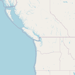


(For the image above, you can try scrolling, using a mouse wheel to zoom in/out, and hover over points.)
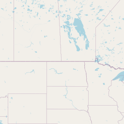
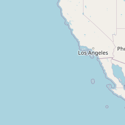
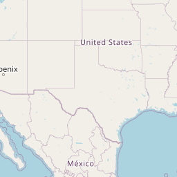
Static images
In case static images are helpful to others:
World Map

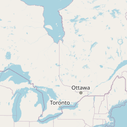
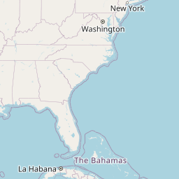
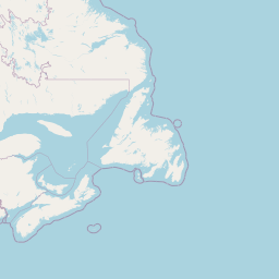
Continental (or conterminous) United States
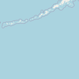
Alaska

Hawaii

Pacific

Why this is a waste of time
The original purpose was to try to follow the “official” instructions to “interpolate” winds aloft to be useful for a planned cross-country flight path.
I found an API that allowed fetching all the winds aloft data from the official source at aviationweather.gov
Google suggested that I might use the location points (with their associated data) to form a grid and then some form of triangular interpolation; e.g., the R akima package for linear interpolation of irregular gridded data.
This immediately proved to be a stupid idea.
In the vicinity of where I fly, there are only 3 reporting locations: Boston (BOS), Nantucket island (ACK), and Bradley (BDL) in CT. The package wisely does not permit extrapolation (required for anything outside a triangle of available points). Interpolation would not account for geographic features (e.g., a mountain…) that might affect winds aloft.
- there are very few reporting points and altitudes
- simple interpolation is not a good idea (local geographic features)
- not taking advantage of years or decades of local weather information is not a good idea (use statistical learning / machine learning)
- even the official web page for winds and temperatures aloft refers to itself as “Legacy” with the page metadata
Better sources of data: Model Output Statistics (MOS)
Although not an “official” source of data to fullfil the requirements for pre-flight preparation, there are much better statistical predictive models (basically, machine learning) for point estimates of winds aloft.
From a nice article in Flying “What is a MOS forecast?” (written by Dr. Scott Dennstaedt, who along with Doug Morris, both pilots and meteorologists, have a great book called Pilot Weather: From Solo to the Airlines):
MOS combines this “raw” model forecast with geoclimatic data in an attempt to improve upon it using a statistical method. It relates observed weather elements (decades of past observations) to appropriate variables (predictors) via a statistical approach. Because it uses geoclimatic data, MOS is capable of accounting for local effects that cannot be resolved by these models alone. In other words, if the airport is in a valley or on a hilltop or next to a large body of water, MOS is able to account for that local topography. It’s a lot like the old local pilot who has been flying for 50 or more years that can tell you exactly what to expect on the final approach when the winds are coming off of the mountains west of the airport.
I assume that MOS is the source of information for aviationweather.gov‘s gridded wind forecasts (a wind barb is plotted every 7.5’ of latitude and longitude, and increments of altitude can be selected).
Other websites (eg, SkyVector) and electronic flight bags (eg, Foreflight) automate many of the navigation calculations and presumably also use MOS for more accurate data.
Pretty much the only real purpose that I (granted, as an inexperienced student pilot) can see for using the official FB information is:
- for the FAA knowledge test and for the pilot oral exam
- for documentation purposes of being within regulations for pre-flight preparation
- to sanity check MUCH better sources of data, like MOS
Conclusion
So in the end, there really wasn’t much point in plotting out the Winds and Temperature Aloft (FB) forecast locations.
But the pictures ARE prettier.